|
Upon having my meeting with the client for my ident I've decided that there is not need to change anything that is already in the proposal and just to add a section about the sound effects that can be included in the ident. Original Proposal I have chosen to rebrand BBC Three as it has undergone a major change that most television networks would never do. This is of course the moving of the channel from digital TV to Internet broadcast. This change occurred in early 2016 and saw a rebrand of the channel that had quite a negative response for the viewers. This maybe due to the rebrand not being very well executed or the removal of the channel from television. I decided that I wanted to give this channel a rebrand to see if I could do a better job than the previous rebranding done in February of 2016. I am going to rebrand BBC Three by giving it a new ident similar to that of idents in 2010, this allows me to communicate more with the past audience of the channel. I have also created a new logo for the channel, which can be used and modified into many more idents in the future The key target audience for this rebrand are the people who used to watch BBC Three but have either stopped completely or reduced the amount they watch of the channel due to the more effort required to now watch. This audience is still within the target age range of BBC Three. I would also like to think that my ident idea could also captivate the younger half of the target audience and keep them hooked on the channel as well. The key content of the ident is the new logo and old characters revived from a previous ident. Bringing back these character can enable for new idents to be more creative and give a small and short narrative. Additional information about audio and sound effects For the sound effects for the beginning of the ident when the cubes are falling from the top of the screen, i am between the choices of having a metal hitting metal sound effect or a wood on wood effect. This decision will be made after the ident is in production. This is due to being able to try out both effects to see which one would sound better. The sound effects for the stretching and the jumping of the blobs is hard to describe other that just simply stating stretching rubber and rubber hitting a surface. Bellow are videos of example sound effects for the ident.
0 Comments
Transcript
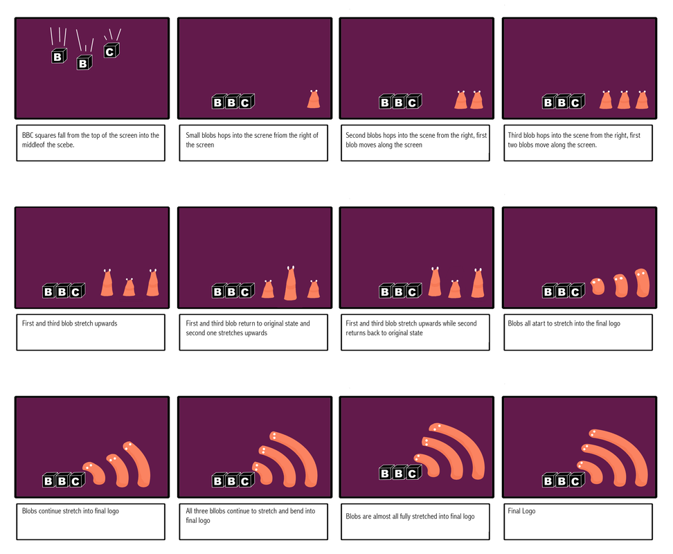
Jamie: So the idea is there's just a blank purple scene, and from above fall in the cubes with the BBC logo in. Then after they've settled in the right order from the right hand side of the screen the blobs from the old BBC idents jump inro the scene. After a while they elondate and stretch into the new logo. Bond: What kind of sound effects are you going to have for that? Because I've got a kind of rough idea of how I think it could work. Jamie: Well, I haven't really thought about the ideas for the sound effects for the blobs, but obviously for the cubes its just going to be something hitting the ground. Bond: Yeah. Jamie: But I haven't thought much about the sounds for the actual blobs yet. Bond: Yeah, like a buffeted sound. So it doesn't sound too harsh Jamie: Yeah. Bond: What age group is this for? Jamie: Its for 16 to 25 ish Bond: And you think its, because it sounds very much like a cbeebies sort of thing Jamie: Yeah, but its trying to mimic the old style of the old bbc 3 logos from 2003 to 2008 Bond: And, what program will this be for and what season, what would be the point in rerbranding? Jamie: The point in rebranding was because bbc 3 recently rebranded and had kind of negitive feedback from their audience, so I thought I'd try again. Bond: Okay so, what was the negitive feedback? And how would this one be able to ivade that? How would it be much better? Jamie: The negitive feedback was that the logo didn't really make much sense, because it was just two lines and an exclamation mark. People thought it was bbc 2. Bond: Because of the 2 double lines, yeah Jamie: People comented how it looked like a mock logo that was made during one of their old tv shows to make fun of logo design. So that’s why a lot of people didn't like it Bond: Okay, and are there any sort of track records that this one was successful and received well? Jamie: Well it lasted a couple of years, so I assume it was quite succesful Bond: Yeah. And the other thing would be how would it identift with the ethos of the channel and channel identity Jamie: Well it sticks with the theme of being more light hearted and fun and keeps with the channel colours that have been used since the creation of the channel. It creates an overall fun vibe for the ident Bond: Okay, so that’s quite good. I think that you've got to go on to the sound. Because it's minimalistic to some extent since you've just got a plain background and then at the fore ground you've got all the action going on.With all the boxes and all that. You don't want it to be too hard hitting. And then you want to think about when the blobs extend as well. And what kind of sound that would make as it would give it nicer polish and meaning to it. I think of course. What software are you using? Jamie: I was thinking about using Maya auto desk, but I need to look into that more because I need to find out if I've still got it. Bond: Yeah Jamie: And how the animation actually works on it. Because I've only done the 3d modeling before. Bond: And you're not going to consder any stopmotion in it? It’s all going to be digital? Jamie: Yeah Bond: And you can use that and you can handel that quite well? Jamie: Yeah Bond: Okay. Well I think it’s a fantastic idea. I think once you're able to master the actual software it’s a really good idea. Sound is thing you need to think about and there needs to be consistancy in the kind of sound in order to invoke the emotional responce from it aswell. Jamie: Yeah Bond: You don’t want it to be too bellow the target audience age which is what? 16 to 34 which is what the bbc three kind of age group is. Jamie: Yeah Bond: Then again you don’t want it to be to hard hitting so it goes into a different genre, likes its looking more like rock. But just making sure that its appropriate for that age group, and that it also firs with the whole channel ethos. Jamie: Yeah Bond: I know that one of the things in the research was to do with circles. You haven't mentioned anything to do with circles? Jamie: The circles theme was mainly to do with BBC one, rather than bbc Three Bond: Oh right. With the singular cirlce and the world kind of thing. There are aspects of that in all the bbc themes. It would have been intresting to have that. How are you actually going to have BBC Three? Jamie: Well from the logo the lines create the 3 with the 3 lines. Bond: Oh the three lines, but they're more of the half cresent Jamie: They represent the signal lines because its online now. Bond: Oh because there are 3. And the bbc? Jamie: On the BBC squares that fall from the top Bond: Oh the bbc squares. Yes the cubes Jamie: Yeah. Bond: Yeah that’s a good idea. Yeah definetly. Yeah Jamie: For the sound would I be able to use pre-made sounds? Or do I have to make my own? Bond: You can use pre-made sounds. But you've got to use them from an unlicenced source. Jamie: Yeah Bond: So you can go to. Theirs is lots of like sound effect like loops that you can find on garage band Jamie: Yeah Bond: and logic. Which is all on the system here because its linked with the music department. I've also uploaded a whole lot, thousands of files of sound Jamie: Oh right Bond: So if you go into my folder and click into that you'll be able to find some sound files Jamie: Okay The idea behind my new ident is to bring back one of the old themes used by BBC Three. This theme of idents is that of the ones made between 2003 and 2008, being idents featuring small anthropomorphised slug like characters. The new ident is based on the idea of these characters morphing and stretching into the new logo I created in a previous task. The ident starts with a blank purple coloured scene, with medium sized cubes with the BBC logo on them falling from the top of the screen. The cubes land towards the left of the scene with an audible sound. The ident continues with the slug characters hopping into the scene from the right of the screen. These slugs hop into the scene in a uniform and semi-synchronise manor. The slugs will then reach the point in the screen in which they will stay for the remained of the ident. Each of the slugs are sitting equidistant away from one another and are bobbing up and down in a disorderly manor. The slugs start to bob up and down faster and faster, until they finally start to stretch and extrude into the final logo. The final logo is very similar to that of the final logo, however the wireless indicator lines are coloured the same as the slugs rather than pink. The lines are also still representative of the slugs as they are the same colour, texture and still include the occasionally blinking eyes.
The ident that I intend to create is not one that can be attributed to a specific time period. However the theme of the ident can stay consistent with new ident and alter to be time or program specific. For example the ident could stick to the theme of slugs but change the slugs to be in different scenes depended on the time of day. Another thing that could be done is that the slugs could mimic scenes from the television show that it is show before. The theme behind the ident could expand in the future by making the slugs do and perform different scenes that are associated with an aspect. For example for a time specific ident the slugs could be in a Christmas scene if it is that time of year. Or in the case of a program specific ident the slugs could imitate a scene from the show, such as them mimicking a scene from family guy. The ident could potentially be expanded into a full set of idents that can be used throughout the channel at different time or events. I can keep the theme of my ident throughout multiple idents by keeping the same characters of the slugs in all of the idents. This will allow for me to keep a constant theme through the channel that will allow for a continuous identity to be created that can always be associated with the channel. It also allows for the idents to create characters that can be recognised and related to by the audience. The last memorable ident for BBC Three have kept a similar theme through out by always having scenes that follow specific aspects. These aspects where colourful, light-hearted, fun, complicated and lots going on. These idents were successful because people liked to watch the idents for their slight comedic value as well as trying to figure out different aspects of the ident when watching it multiple times. I am rebranding the channel of BBC Three because the channel was rebranded for when it was moved from the television to the internet recently and it wasn’t very well received by a large proportion of the audience. So I decided to bring back a theme that was more successful for the channel that was previously used. I decided that this theme that was used previously used could be a better way to represent the channel because it better communicates the ideals of the channel. |